Wednesday, June 29, 2022

Learning from the Pros

Hydrangeas2 per Shari B demo
Watercolor
6" x 9" Arches cold press paper

I mentioned earlier this year that I was looking forward to a 5-day workshop in early April with Shari Blaukopf, one of my very favorite contemporary watercolorists. Held in Santa Barbara, a place I've been wanting to explore, the workshop was to be a retirement gift to myself after decades of balancing day jobs with creative projects in art and writing.  

Unfortunately, a family emergency took priority and I missed the workshop. What's that saying about best-laid plans? 

But I gifted the workshop to a friend--an excellent artist herself--who had a great learning experience. And fortunately, I still have life-time access to a number of online classes that I've purchased from Shari. They're not the same as working with someone in person, but they certainly help. I would recommend any of her online workshops. 

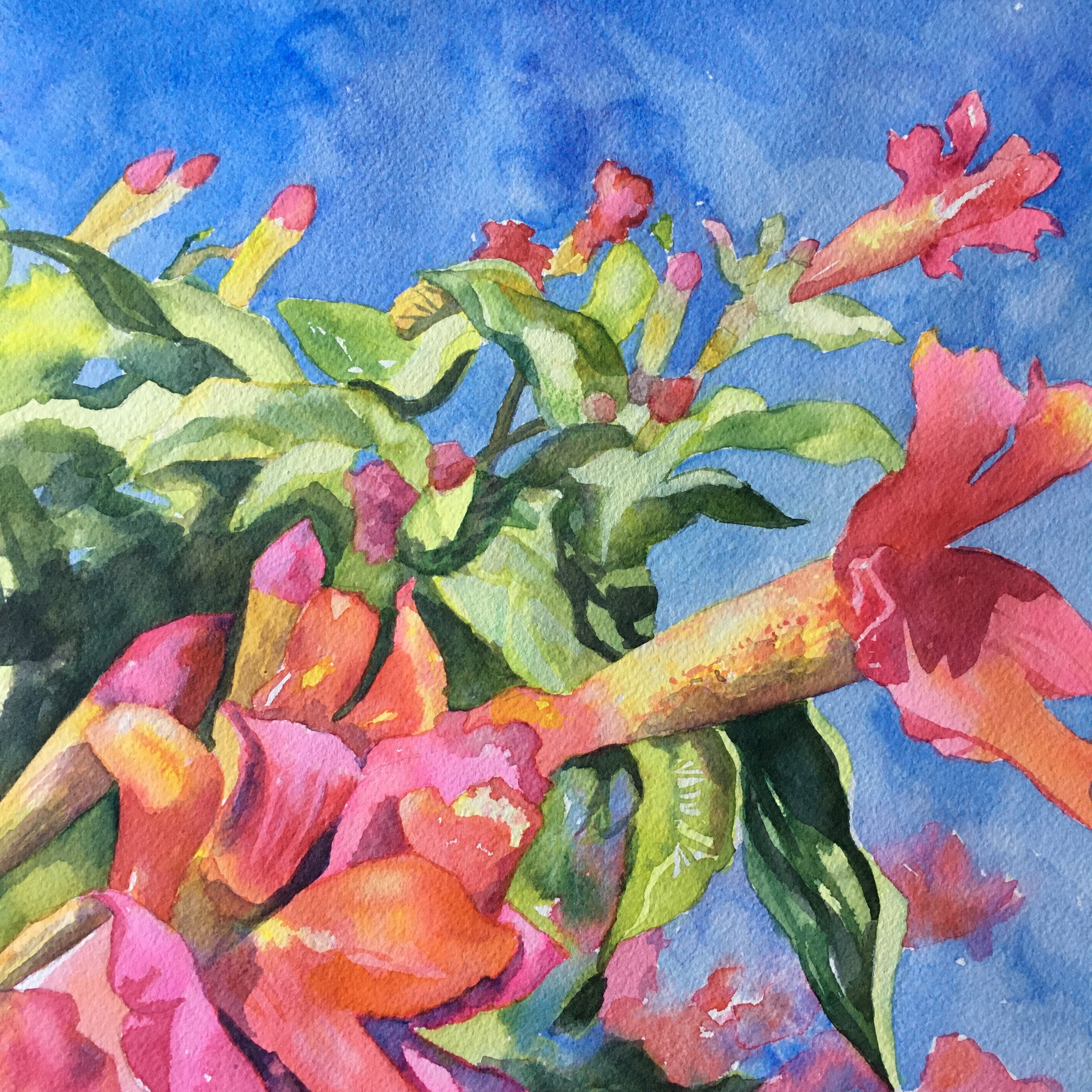
Currently I'm working through the one called "Sketching Fresh Flowers." I think I'm finally understanding how much to saturate my brushes with water and paint when I want luminous color with the first application. 

This imitation of one of Shari's demos of painting hydrangeas still doesn't hit the high mark that she establishes. Even so, I feel like I'm having this mini-breakthrough about color/paint saturation that I hope will help my continuing efforts to grow as a watercolorist.

Below is my first version of Shari's demo. I liked the juicy colors on the hydrangeas, but I made the background much too dark. Yet Version 2, above, is a little too timid--not juicy and splashy enough. 

Hydrangeas1 per Shari B
Watercolor
6" x 9" Arches cold press paper

Sometimes it does help to imitate paintings created by the pros. I would never pass my imitations off as my own creations. Now it's time to apply my new knowledge to my own compositions. The sooner the better because these insights don't always last long. 


Friday, June 24, 2022

Last Call...for Now

Trumpet Season6
10" x 10" watercolor
on Arches 100% Cold Press paper

Yeah, I'll admit to a bit of an obsession re: this trumpet flower composition. Thought I was finished last time, but I guess not. I wanted a combination of loose and controlled. I came closer this time, but it's still not at all what I had in my head. 

But for now, this is last call for the trumpets.  

Tuesday, June 21, 2022

Will It Last?

Garden Selfie
8" x 12" watercolor
Arches 100% cotton cold press paper

Kinda pleased with this one, I have to admit. 

Will that feeling last?

I'll know after a week or two of having it taped on the wall. Some paintings lose their luster after a few days. Some I grow more attached to. I never really know how it's going to go. 


Saturday, June 18, 2022

Final Word


Trumpet Season5
6" x 8" watercolor
on Fluid Cold Press paper

I couldn't let that last version on the trumpet flowers have the final word. Here's the final word. Looser, in line with what I had in mind in the first place. But not necessarily better.

I have so much to learn; isn't that exciting? 

Okay--now it's really time to move on. 

Thursday, June 16, 2022

One More Revision


Trumpet Season4
6" x 6"" watercolor and watercolor pencil
on Arches 100% cotton hot press paper

I belong to a Facebook group called "All About Watercolor," and I highly recommend it or similar artists' sites on Facebook because you can often get some helpful advice from other members. 

I posted yesterday's painting and told the group I felt it was blah despite the vibrant colors. Within minutes I received advice to add a few darks to make the medium-values pop (done), do some lifting in order to have lighter highlights (I added white gouache here and there), and add detail to the lower left flower (I decided to crop much of it out, instead). 

Overall, I'm more satisfied with this version, and I'm grateful to the group for their (free!) suggestions. 

I also know that the most important thing to do, usually, is go on to the next painting. 

Wednesday, June 15, 2022

Third Time's a Charm...?

Trumpet Season3
8" x 8" watercolor and watercolor pencil
on Arches 100% cotton hot press paper


Or maybe not. I still might like the first looser version better. 

But I had fun trying on this one. It became quite meditative toward the end as I added shading here and there with watercolor pencils. 

P.S. This is another one that is actually better viewed in person. The colors are a tad more nuanced. Just a tad. 

Tuesday, June 14, 2022

Trumpet Season

Trumpet Season
8" x 8" watercolor
on Fluid watercolor paper

It's trumpet vine season out here in northern California, and I so love these bountiful vines. 

I did a color study from a photo I took in my Speedball sketchbook. It's a lovely hardback, spiral-bound 8" x 8" book with Fluid watercolor paper, which means it handles ink nicely, along with the w/c paints. Although in this case I used no ink--it seemed important to just paint directly, with no drawing in ink or even pencil. 

Then I shifted to a "real" painting on Arches 100% cotton cold press paper. I made a sketch in pencil. Then, as is not always but often the case when I shift out of the sketchbook, I clutched. Tightened up. Over-applied paint. Used too many layers. Got too dark in areas and then tried to lift out the darkness. And on and on. 

Here's what I'm talking about, in case you don't believe me: 

Trumpet Season2
8" x 8" watercolor
on Arches 100% cotton watercolor paper

Next up: the plan is to:

--Go back to a direct approach (no drawing) on a piece of Arches hot press paper. 

--Use a slightly different palette. Will keep Quin Rose, Quin Coral, Opera Pink, Lemon Yellow, and Cobalt Blue. But no Prussian Blue this time. Instead, French Ultramarine. 

--NOT try to represent the photograph realistically, even though it is a darned good one:


Wednesday, June 8, 2022

Babbling Bluebells


"Babbling Bluebells"
7.5"  10.5" 
watercolor and watercolor pencil
on Arches 100% cotton hot press watercolor paper

I found these Virginia bluebells talking away in early May in a woodland in Ames, Iowa. 

I'd snapped such a lovely photo (see below) that I knew would be difficult to paint from. The temptation is to try to duplicate it realistically, but to do so is to only set myself up for frustration--at least with my current skill set. 

So I focused first on rendering an essence of the bluebells without trying to be so literal. And then I decided to see what lemon yellow and a little opera pink would do for the background. 

I'm not sure the lighter left side of the painting balances well with the heavier right side, but there are a few things to like here, IMHO. 

And though sometimes the digital versions of these paintings are better than the originals, this time I would say the painting is actually better viewed in person. You'll just have to take my word for it. 


Wednesday, June 1, 2022

Another Peaceful Meditation

Shy Iris Garden Selfie
10" x 10"
Arches cold press w/c paper

Yes, sometimes you're just in the mood for some slow, meditative painting. 

One day I may have better skills and know how to fix this piece, which has some things going for it but many things not. Meanwhile, I appreciated the R&R gift that painting the painting gave me. 

More About the Sally Project

I met Sally forty years ago when I was twenty and she was the one in her sixties. I was a waitress at a Howard Johnson’s restaurant on...